The Brand That Had to Disappear
The Real Problem
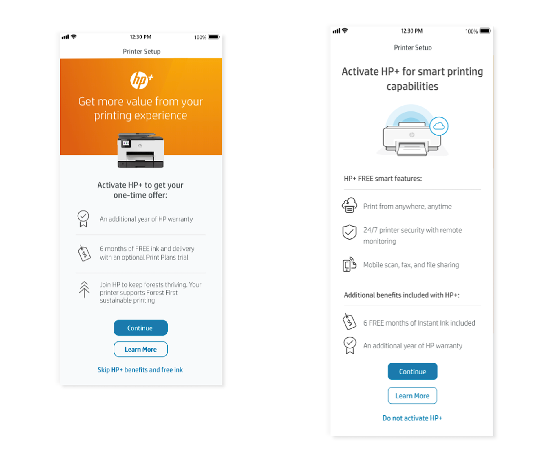
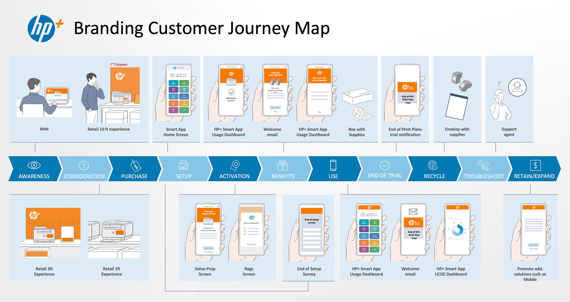
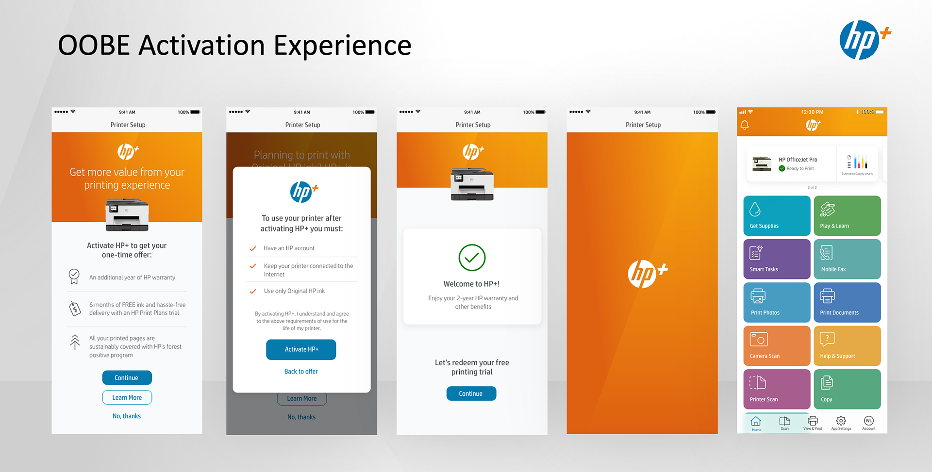
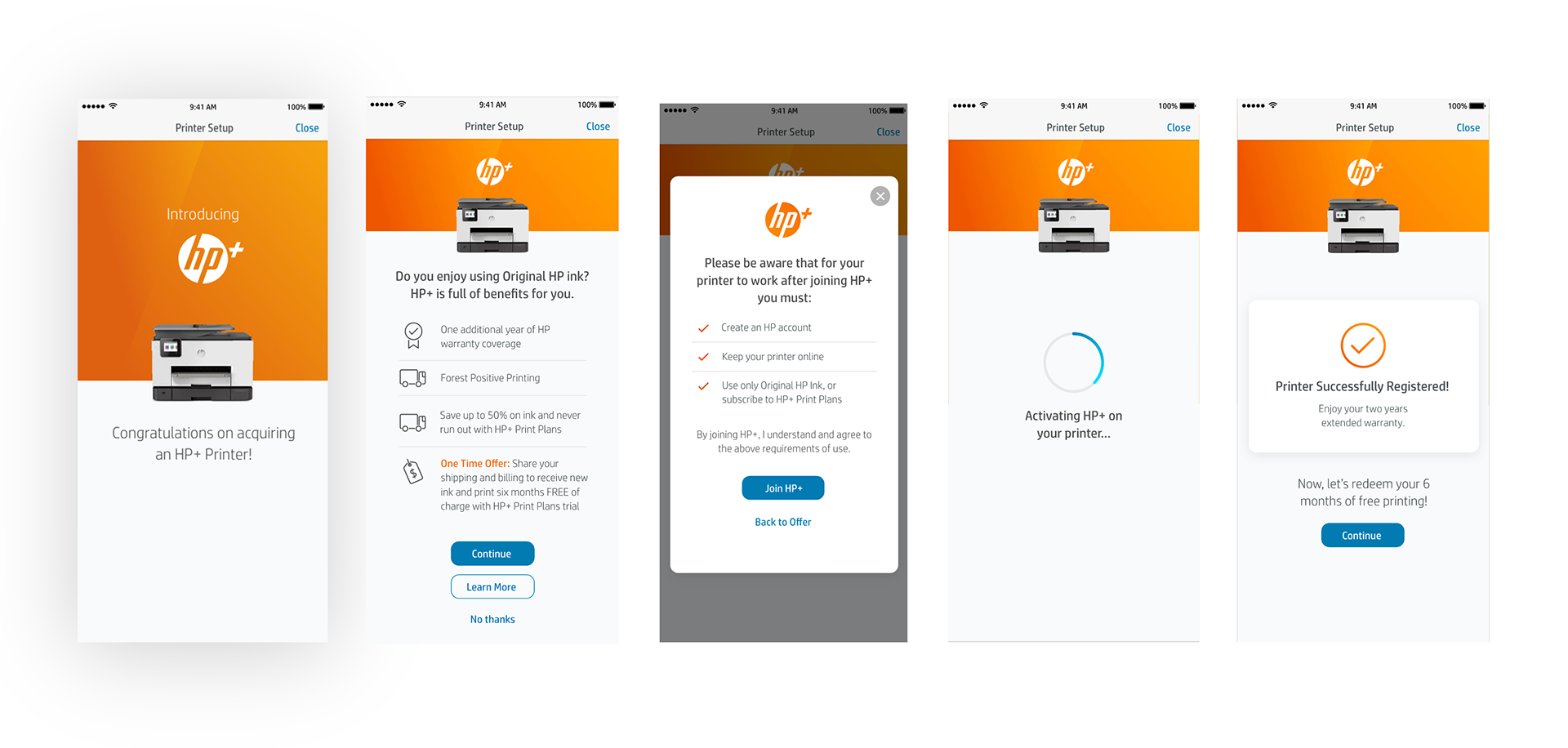
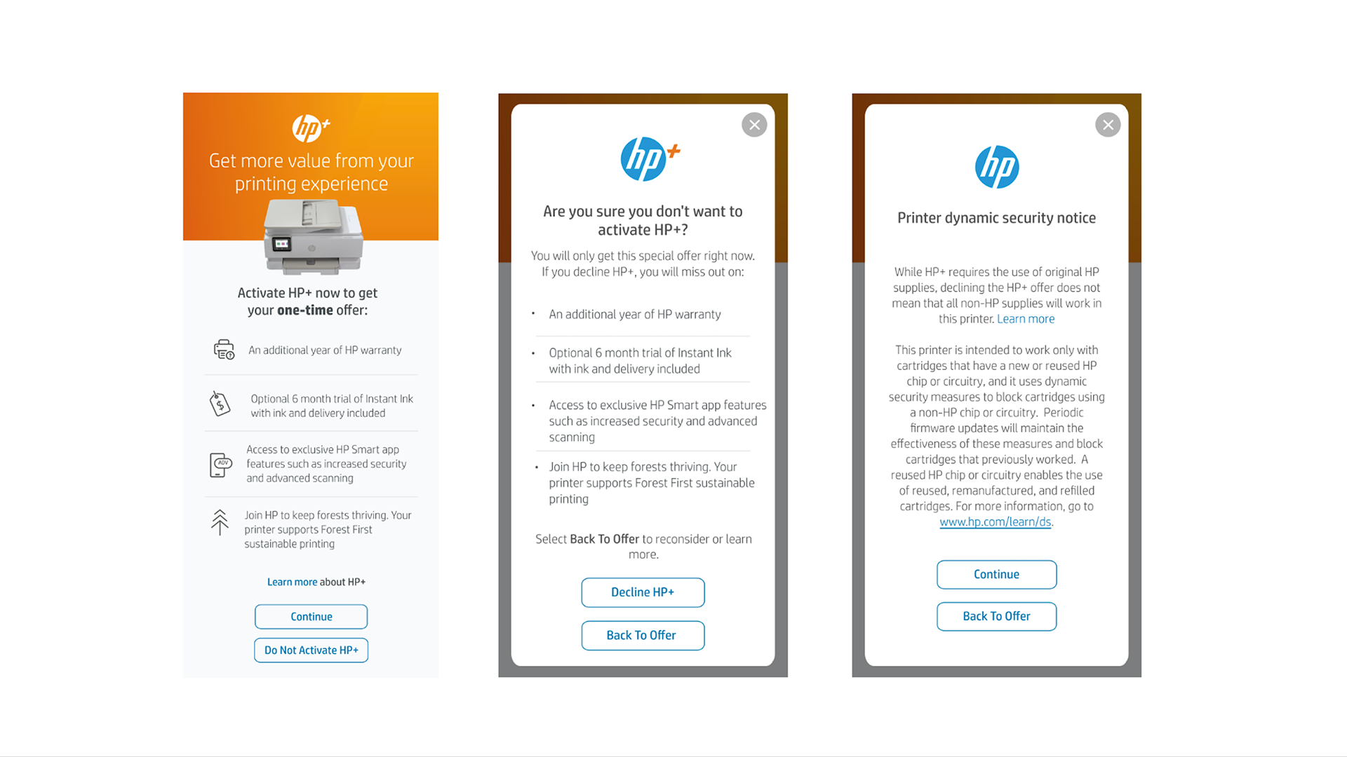
HP+’s onboarding screens carried the loud, promotional visual language of an upsell: bold orange blocks, marketing copy, a value proposition dressed like a sales pitch. Inside a printer setup flow customers were racing to finish, that pattern registered as something to skip. Research confirmed it: people assumed HP+ cost money, or worse, assumed it was one more obstacle between them and a working printer. The design itself was signaling “marketing” to an audience already trained to filter marketing out.
The Creative Decision That Changed Everything
The instinct on most brand teams is to push hard: bigger logo, more color, repetition until recognition sticks. When nothing worked, I proposed the opposite. Strip HP+’s promotional identity out of the primary onboarding funnel entirely, and rebuild it to look and behave like the rest of the trusted setup experience: white background, instructional tone, product-first sequencing instead of brand-first framing. The goal shifted from recognition to trust.
The Work
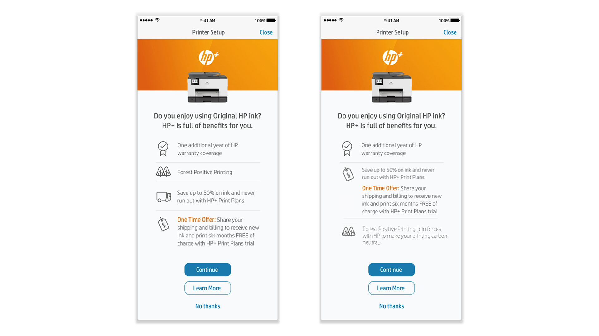
I partnered with Product to achieve the 65% activation target by year-end and led a 25 person multi-disciplinary creative team through the redesign. We ran rigorous A/B testing across UX/UI, messaging, and workflow variations. We simplified the value proposition into something concrete, “smart printing,” not abstract loyalty language. And we replaced the brand-forward onboarding screens with neutral, instructional UI patterns inside the HP Smart mobile app, the largest single adoption funnel in the print ecosystem.
The Results
We beat the target: 68% activation against a 65% goal.
What It Taught Me
Not every touch point wants more brand.
The instinct to build recognition through visibility is right most of the time. HP+ is the one project where it worked against itself: customers filtered the loyalty program out precisely because they recognized it as marketing, inside a moment where marketing felt like friction. Pulling the branding back, rather than pushing it forward, is what earned trust. Visibility only builds trust when the audience is ready to receive it—everywhere else, restraint is the more sophisticated design decision.