The World YWCA had been around since 1855. That’s not a footnote—it’s the whole problem.
The Real Problem
An organization that has survived two world wars, the suffrage movement, decolonization, and the digital revolution had earned something most organizations never get: generational trust that accumulates over time, the kind you cannot manufacture and cannot afford to lose.
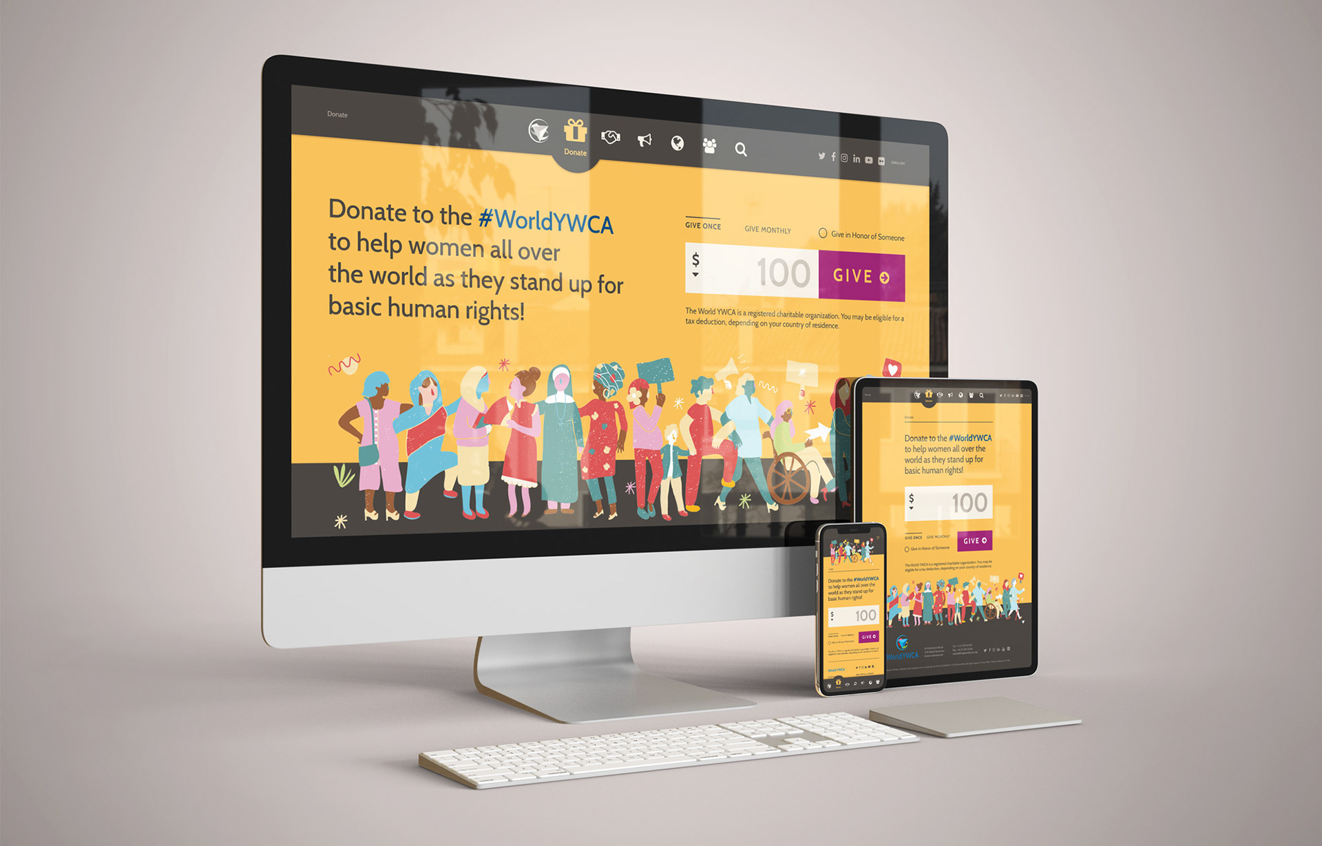
What it couldn’t afford to keep was a website with a broken donation page, outdated content, and an information architecture so bloated that the people who needed it most couldn’t find what they were looking for, or find it on a device they were actually using.
The World YWCA didn’t come to me with a brand problem. They came to me with a technical one: fix the donation page and update the website. What I found underneath was something harder and more interesting. An organization with a powerful mission and no clear language for it, trying to reach a generation it didn’t yet know how to talk to, without alienating the one that kept it alive.
The Research
I had never designed for a global audience before. That required knowing things I didn’t know. The first thing I did was look up who I was actually designing for. Not the aspirational audience, but the real one: young women, ages 18 to 30, in low- and middle-income countries, across 100 member associations, many of them accessing the internet for the first time on older mobile devices.
What I found changed everything. 80% of these women owned a mobile phone. Nearly half used mobile internet as their primary means of access. For this audience, mobile wasn’t a preference—it was the only access they had.
The design direction became obvious once the research was honest. Not mobile-friendly, mobile-first. Designed for a small screen, a slow connection, and a user who had never had the luxury of a desktop.
I mapped 18 peer and aspirational organizations ranging from the Malala Fund, Mama Cash, Global Fund for Women, AWID, Girls Globe, HeForShe, and others. Analyzing each by personality, color, layout, and what made them distinctive. I plotted them on a color wheel, and what I saw was a field almost entirely dominated by saturated reds, pinks, magentas, violets, and oranges. Every organization in this space was competing on the same emotional register.
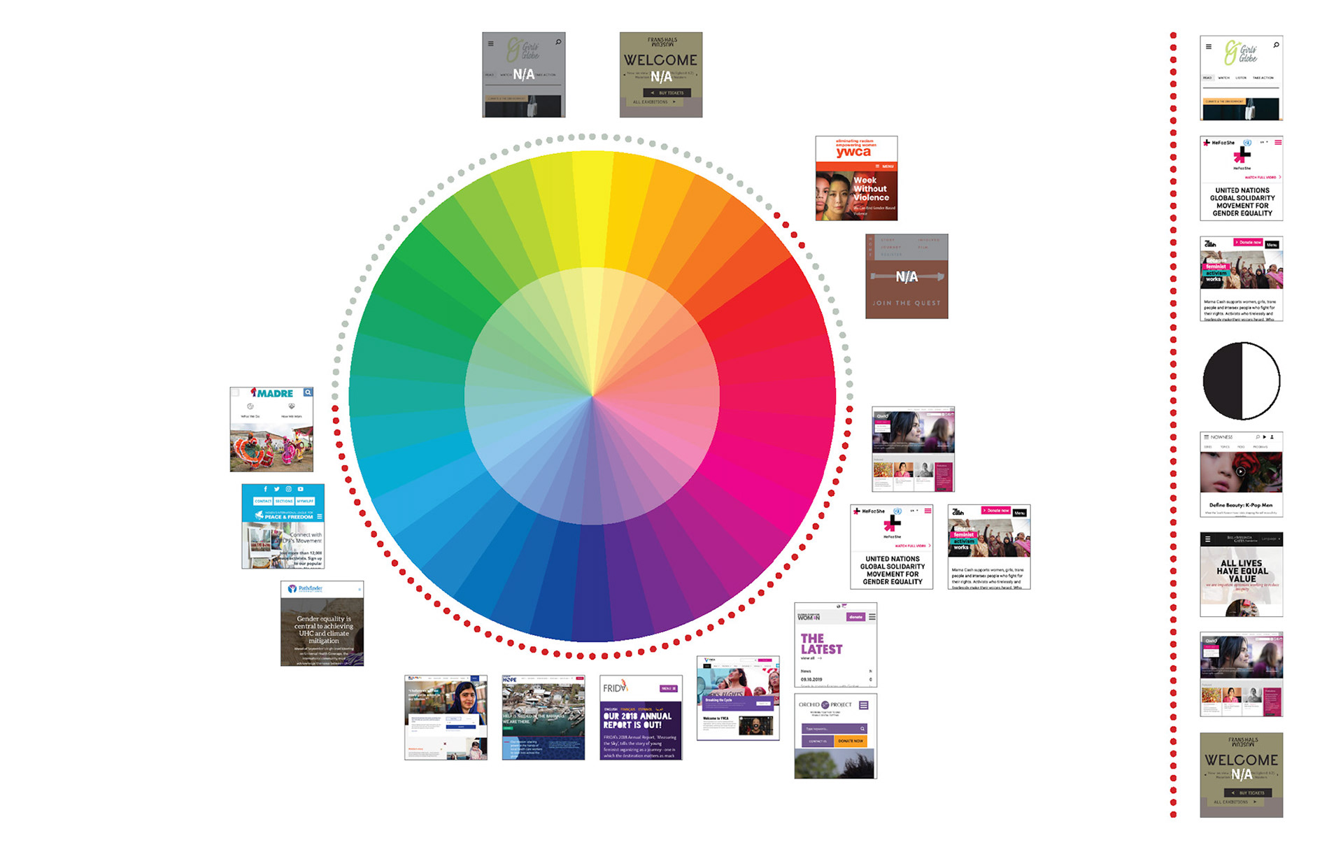
The whitespace was neutral. Clean, warm, and considered. A palette that could feel modern without screaming for attention, sophisticated without alienating donors who had been giving since before the internet existed.
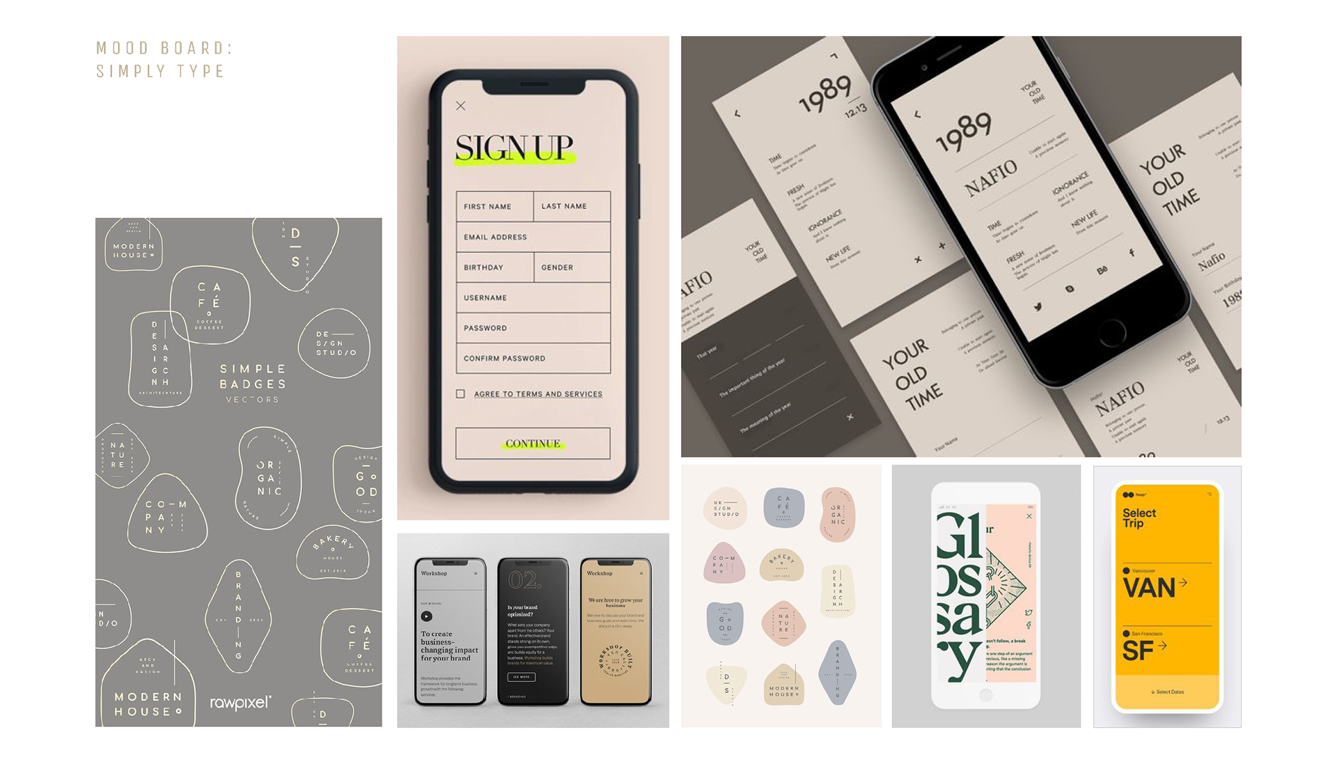
I developed three creative directions: Neutral Blocks, Simply Type, and Gestural Lines. Each had its own personality and visual logic. Each was a genuine answer to the design problem. The research brief that framed those directions didn’t stay with the clients I was hired by, it traveled up to the General Secretary and CEO of the World YWCA Casey Harden, who presented it to the World Council in Johannesburg, a gathering that happens once every four years with representatives from every member association worldwide, to explain why the organization was changing how it looked to the world.
I wasn’t there, but the work was.
The Creative Direction That Changed Everything
The brief I wrote for myself before touching any design: the World YWCA is not a nonprofit, it’s a movement.
That distinction drove every decision. Nonprofits describe what they’re not—movements describe what they’re for. The World YWCA had a specific, ambitious vision: by 2035, enable 100 million young women and girls to transform power structures to create justice, gender equality, and a world without violence and war.
The design had to carry that weight without losing the warmth that had kept three generations of women inside the organization.
The Work
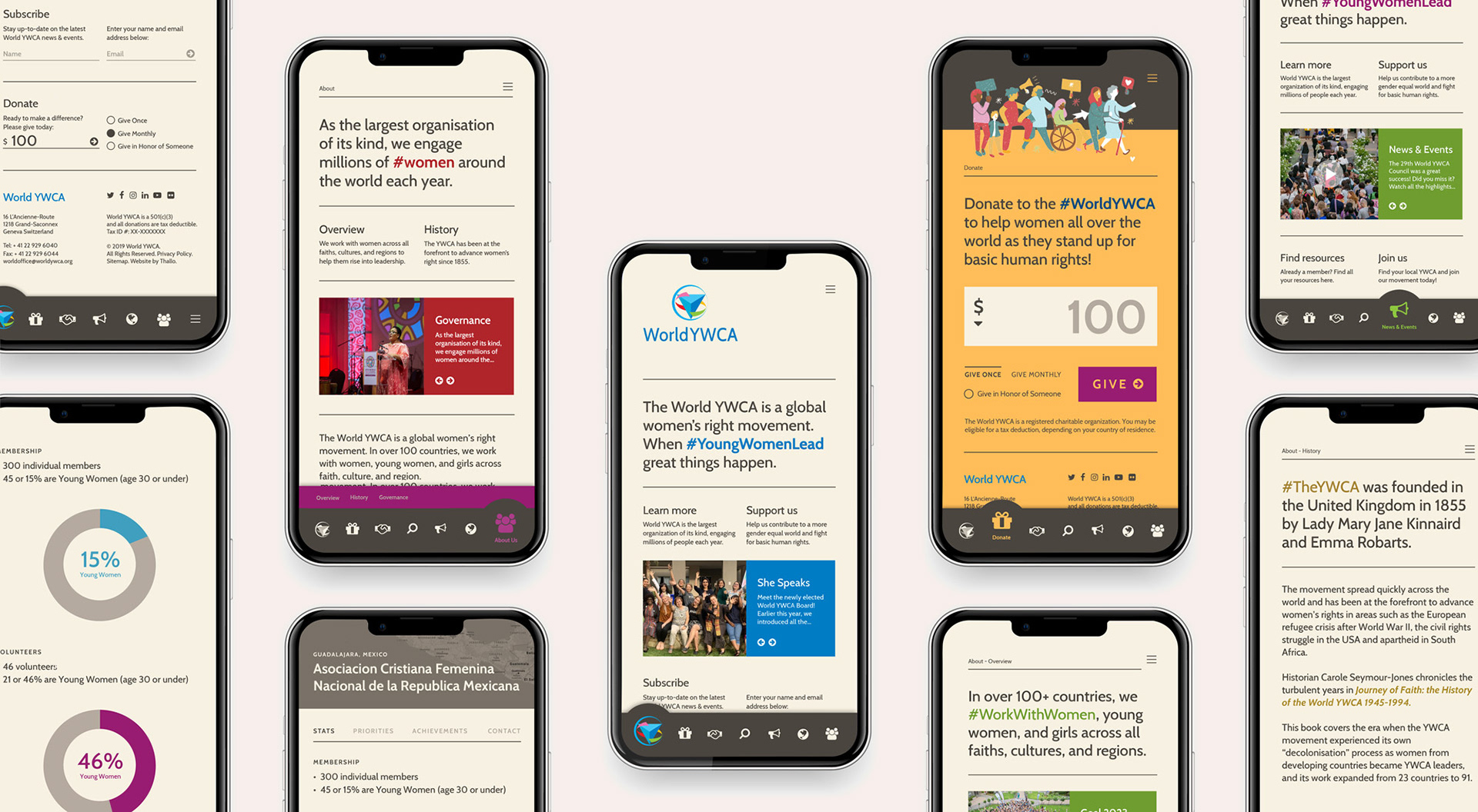
Mobile-first meant content-first. A typographic system that let the mission speak without competing with it. Hierarchy and spacing that broke complex information into digestible pieces for someone reading on a bus in Johannesburg, Nairobi, or Manila. Abstract illustration and iconography instead of stock photography that would date quickly and represent no one accurately. The donation experience was rebuilt from the ground up. Not as a transaction but as an invitation.
The Results
The redesigned website launched at the World Council 2019 in Johannesburg, South Africa, reaching representatives from more than 100 member associations worldwide. Within two months, the organization added 11,000 new memberships. The updated donation experience modernized the organization’s primary fundraising pathway, strengthening financial sustainability for the global movement. The research brief became the organization’s internal argument for its own transformation, presented by senior leadership at a global convening to explain why a movement that has survived 165 years was ready to change how it met the next generation.
What It Taught Me
The client who knows exactly what they need is rare. Most clients know something is wrong. They can feel the gap between who they are and how they’re presenting themselves. What they often can’t do is name it.
My job on this project wasn’t to design a website. It was to help the World YWCA find the language for what it already believed, and then build a digital home worthy of it.
The research deck that ended up at the World Council wasn’t an accident. It was what happens when you take the diagnostic seriously. When you don’t skip the hard questions because the timeline is tight. When you treat a generational movement with the same rigor you’d bring to a Fortune 500 brand launch.
The work has to be good enough that someone who wasn’t in the room decides it’s worth carrying forward. That’s the only brief that matters.