Building the Function That Didn’t Exist
The Real Problem
I was brought in to unify HP’s digital experience across sixteen work streams—a function that didn’t exist yet.
HP invented Silicon Valley. It spent decades watching the business it invented slowly commoditize beneath it. When COVID produced an unexpected window, a brief surge in hardware demand that bought time for reinvention, the company moved to transform itself into a digital services and solutions company. The problem was structural: three major business units, Personal Systems, Customer Support, and Print Hardware, had spent years optimizing independently. They didn’t share processes, didn’t share goals, and didn’t share a design language. When the Marketing team introduced a new brand identity with custom font and refreshed color system, it was clear it had been designed for print. On a digital screen, it failed accessibility standards—on a phone, it was nearly illegible.
The company had a new story to tell, but it had no coherent way to tell it.
The Build
The function was called User Interface Creative Direction. I built it without the authority to mandate compliance, which meant the work itself had to be compelling enough that adoption happened by choice.
The first deliverable was a North Star: a documented vision for what HP’s end-to-end digital experience should feel like, rigorous enough to be a reference and honest enough to be useful. Alongside it, a bespoke digital typeface and a WCAG-compliant color system that solved the accessibility failures the brand launch had introduced.
The second deliverable was trust. Roadshows, bi-weekly office hours, and a dedicated channel where teams could push back, ask questions, and see if their concerns were addressed in the next iteration. A system doesn’t hold because it’s well-designed—it holds because the people who have to use it believe it was built with them in mind.
What It Required
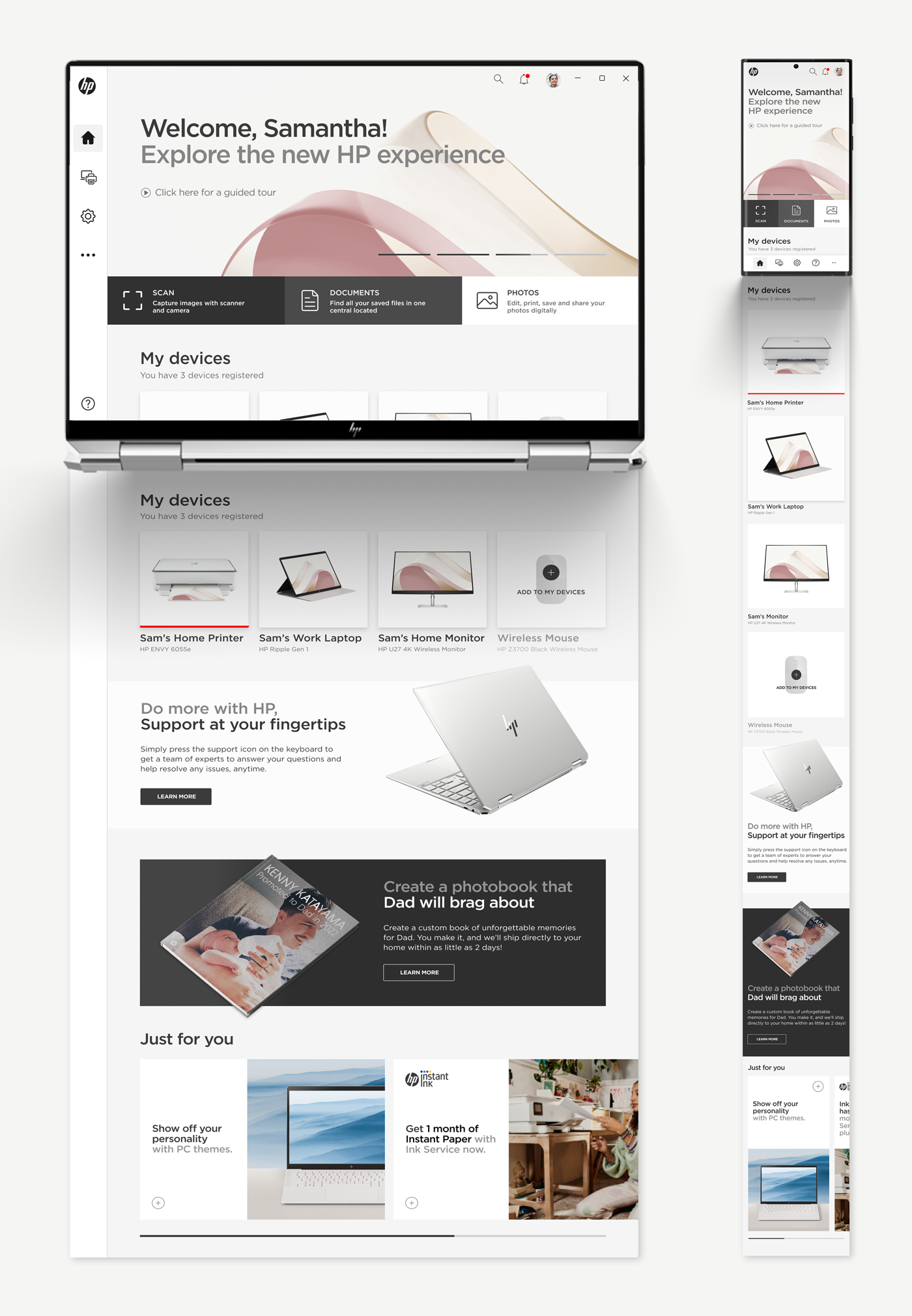
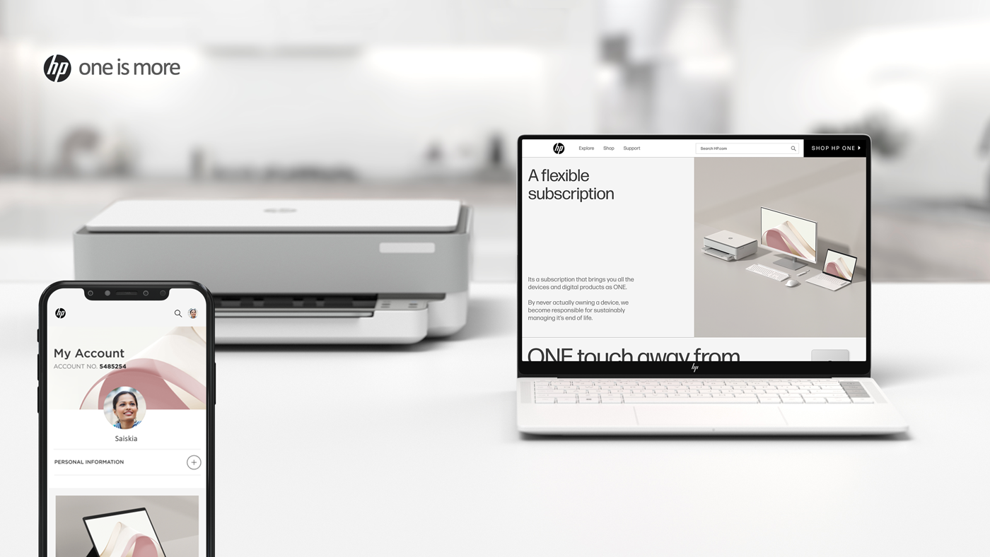
Securing $3M in quarterly funding during a company-wide budget freeze required translating an abstract design strategy into a product vision that executive leadership could act on, not a deck about design principles, but a tangible argument for what coherence was worth financially. The Board of Directors and Executive Leadership Team approved the resulting HP ONE eCommerce subscription and HPX cross-platform app. Both reflected a unified experience that hadn’t existed twelve months earlier.
The hardest part wasn’t the design. It was holding the vision steady across an organization that had 70 years of reasons to revert to its own way of doing things.
The Work
The Digital Style Guide and Content Style Guide weren’t documentation artifacts—they were arguments. Every decision in them had to be defensible to a skeptical audience: engineers who had built their own conventions over decades, marketers who had just launched a brand identity they believed in, product teams who had different definitions of “done.” The North Star only worked if the people furthest from the center could hold it without me in the room.
The bespoke digital typeface came out of a specific failure. The brand font HP had commissioned was beautiful in print and wrong on screen: wrong weight, wrong spacing, wrong rendering behavior on low-resolution displays. Fixing it meant going back upstream, working with the type foundry at a technical level, and making the accessibility case in a language that marketing could accept without feeling like they’d been overruled. The accessible color systems followed the same logic: the solution had to feel like an evolution of what already existed, not a correction of what had failed.
The typeface solved legibility. It didn’t solve recognition. HPX was the first product where all three business units met on one screen: PCs, Customer Support, and Printers in a single cross-platform app—three organizations that had spent years optimizing independently now shared a front door, and the front door was a loading state. A user waiting for HPX to open was, for two or three seconds, looking at nothing.
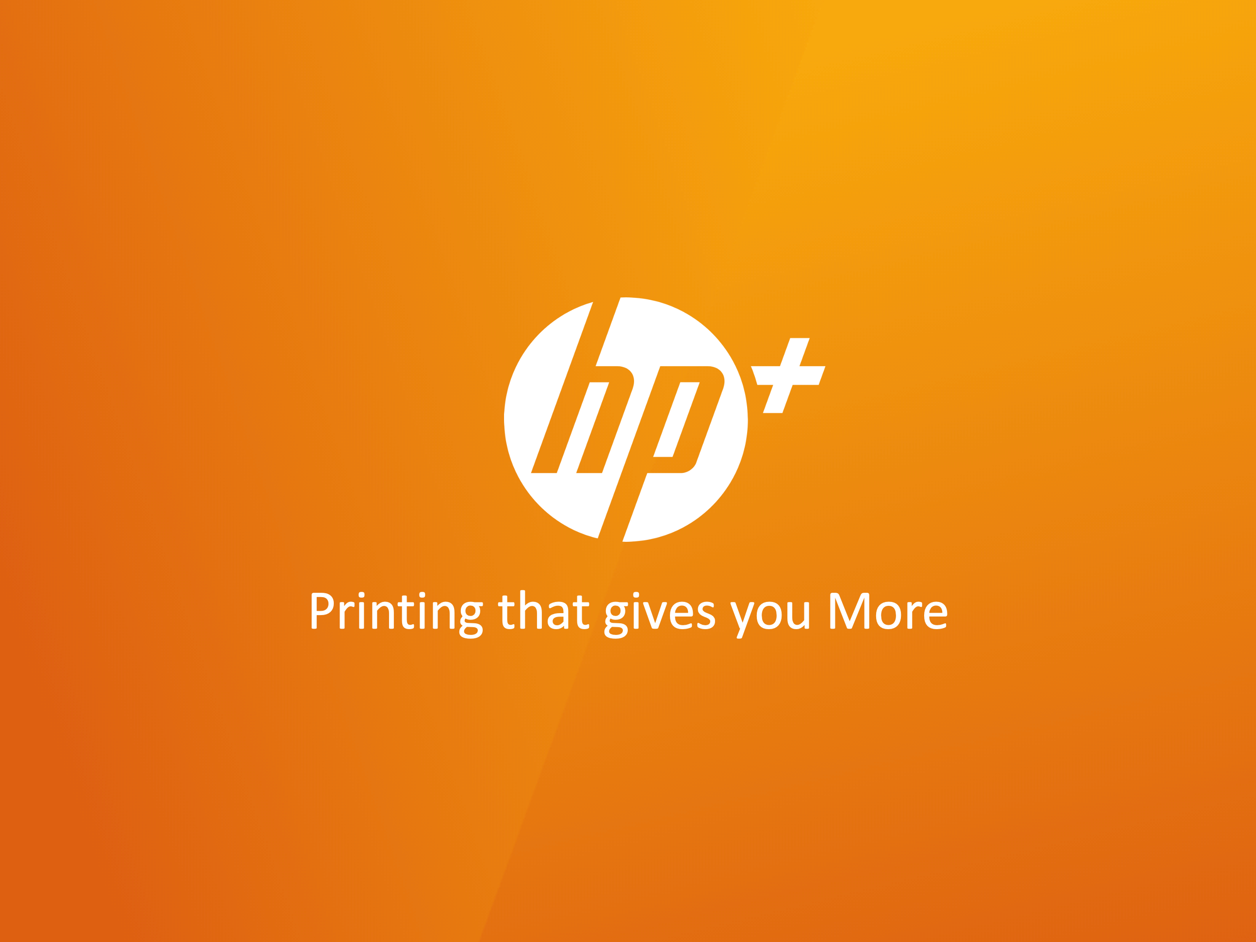
We used the wait. I directed a two-second splash sequence: a laptop, a headset, and a printer, each drawn in a single continuous line, each giving way to the next. The last one resolves into the HP mark. The line work came out of the same discipline as the typeface—one stroke weight, no fill, no color, nothing that needed a better screen than the one customer already had. The morph does the argument the org chart couldn’t. Three things that normally faced customers separately are one thing now, and here’s the mark to prove it.

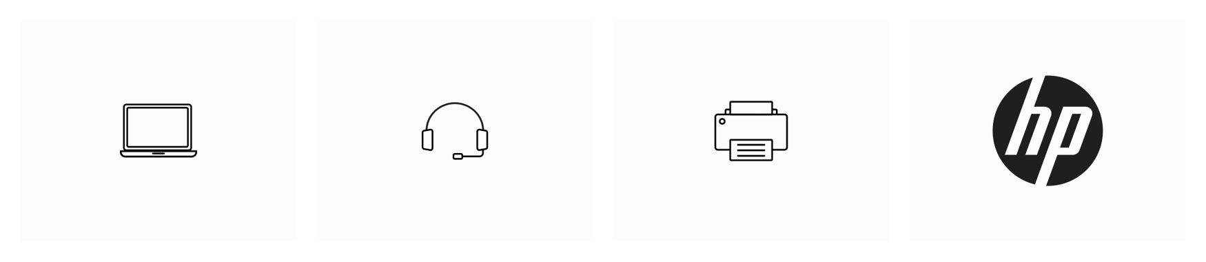
The decision that mattered was the transitions. Each object has to be legible on its own before it gives way: if the three read as one blur, the payoff is just an animated logo. So each reduces to a neutral primitive on the way out: the laptop to a square, the headset to a pill, the printer to a single dot. That dot opens into the mark. Nothing carries from one product to the next except the line itself, which is the point: the continuity isn’t the objects, it’s how they’re drawn. Three outlines into one solid form. The mark isn’t announced at the end—it’s arrived at.
It ran on every HPX launch. The first frame of the product, and the first thing a customer saw of the unified company.
Every work stream had its own lead, its own roadmap, and its own idea of what the brand should look like in their corner of the product. The office hours weren’t mandatory. The room filled because the work was useful, and because people could feel the difference between a team that was building with them and one that was handing down decisions from above.
The Results
The North Star became the internal reference for digital experience decisions across the organization—a document that outlasted the engagement and kept shaping decisions after I was no longer in the room.
Sixteen work streams aligned. One design language. An organization that had spent years fragmenting itself had a shared answer to the question of what HP looked and felt like on a screen directly engaging with customers for the first time.
What It Taught Me
The organizations most resistant to change are usually the ones that earned their way to the top of their industry and never fully reckoned with what that cost them structurally. HP wasn’t broken—it was calcified with layers of good decisions made in isolation that had never been asked to talk to each other.
The work I’m most proud of on this project isn’t the bespoke typeface, the accessible design system, or the style guide, though I am proud of those too. It’s that the function I built continued to function after I left. That the people who had been working in silos for years had a shared language, reference, and reason to use both.
A system that requires its creator to maintain it isn’t a system. It’s a dependency. The brief I set for myself from the beginning was to build something that could hold without me: that’s the only version of this work that actually counts.