Airlines knew ViaSat. Passengers knew Exede. The same company was two different brands depending on who you asked.
The Real Problem
Exede In The Air was winning, and that was the problem.
The service was genuinely better: 12 Mbps or higher to every passenger, regardless of how many connected. Competitors aggregated bandwidth to the plane and left passengers contending for it, publishing a headline speed and then watching it collapse as the cabin filled. JetBlue’s Fly-Fi, powered by Exede, was seeing four times the passenger take rate of Gogo and Row 44. A quarter of all data usage was streaming media, in flight, which nobody else could support.
Every one of those wins accrued to a product name. Passengers who loved the Wi-Fi had never heard of the satellite company that made it possible.
Aircraft Interiors Expo (AIX) in Hamburg is a room full of people who did know. Largest cabin interiors show in the world, three days, hundreds of exhibits, and every buyer in it could tell you ViaSat’s capability story. What they hadn’t necessarily connected was that the service passengers raved about on JetBlue was the same company. Two names, one business, and no decision yet about which one carried it.
I’d worked on ViaSat’s trade environments years earlier as one of the first four designers hired in-house. I knew what a show floor does to a brand that hasn’t decided who it is.
The Work
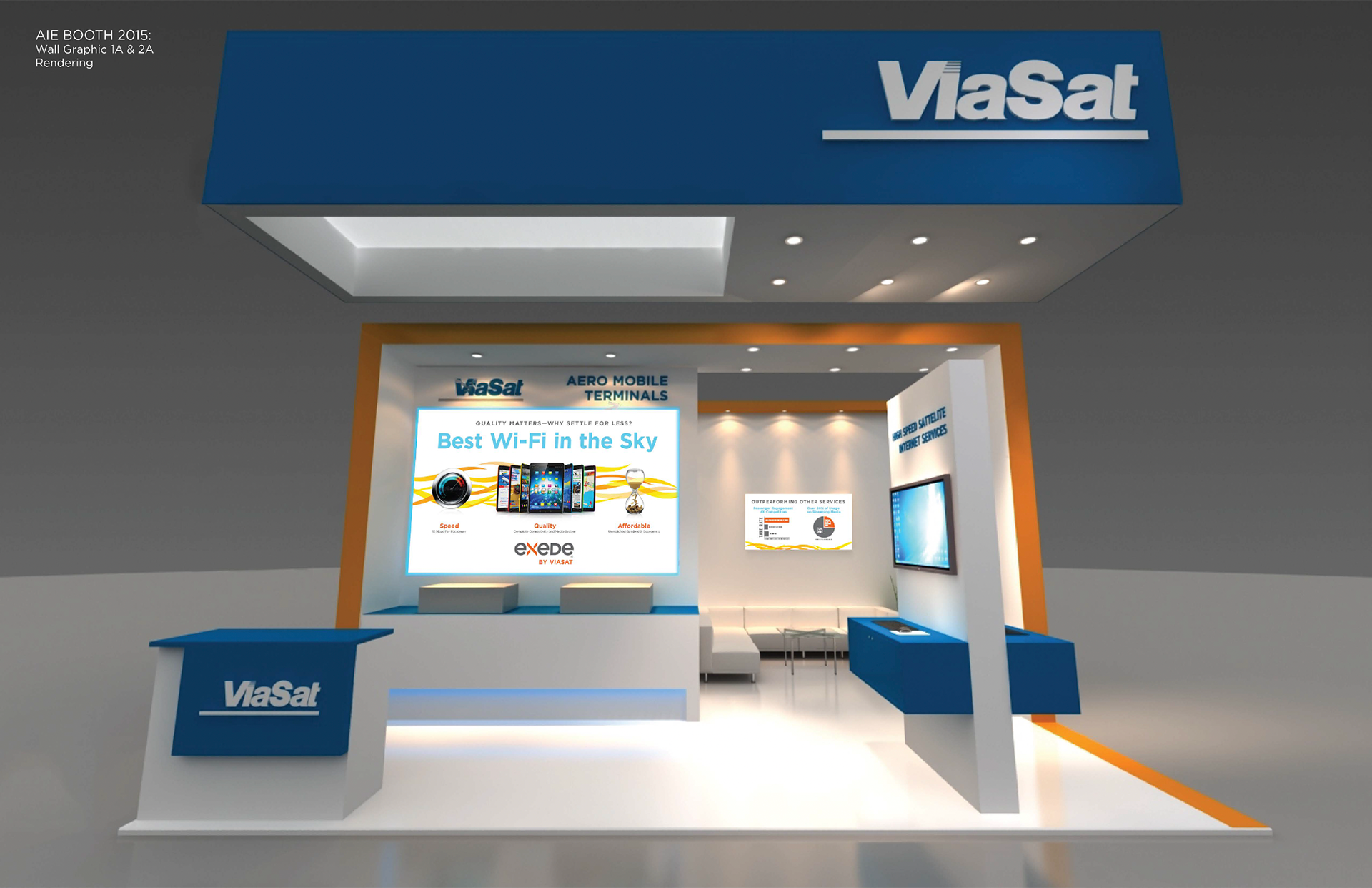
I developed three directions, two of which took genuinely different positions.
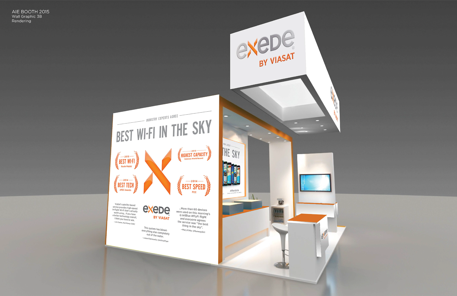
Direction one: proof by documentation. ViaSat leading, blue fascia and reception desk, the corporate logotype at the top of the structure. An actual take-rate bar chart against named competitors, a usage breakdown, gold medallion laurels, and three third-party quotes from Jim Cramer, Jason Rabinowitz, and Mary Kirby. Built for the buyer who intends to interrogate you and finds documentation waiting.
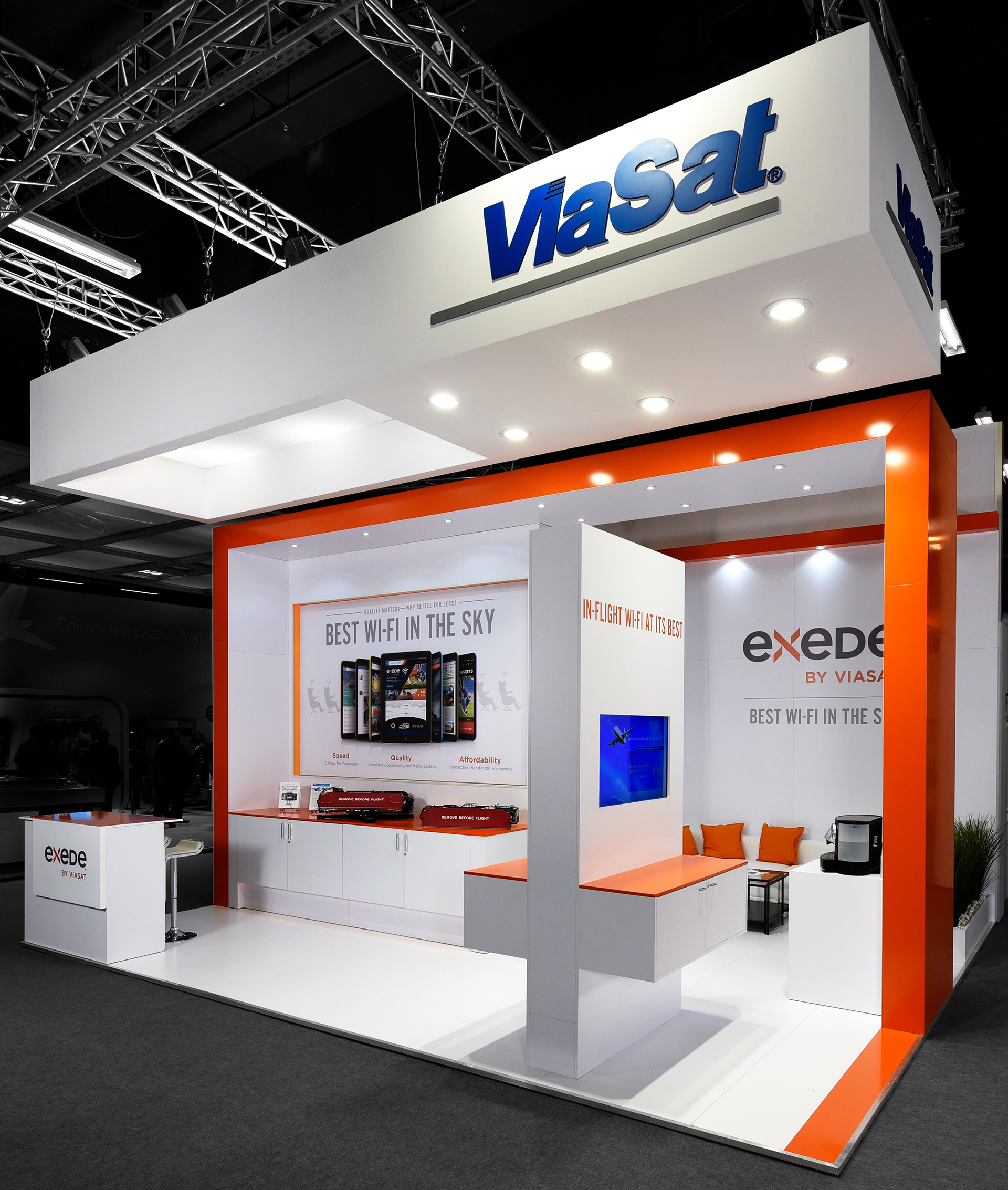
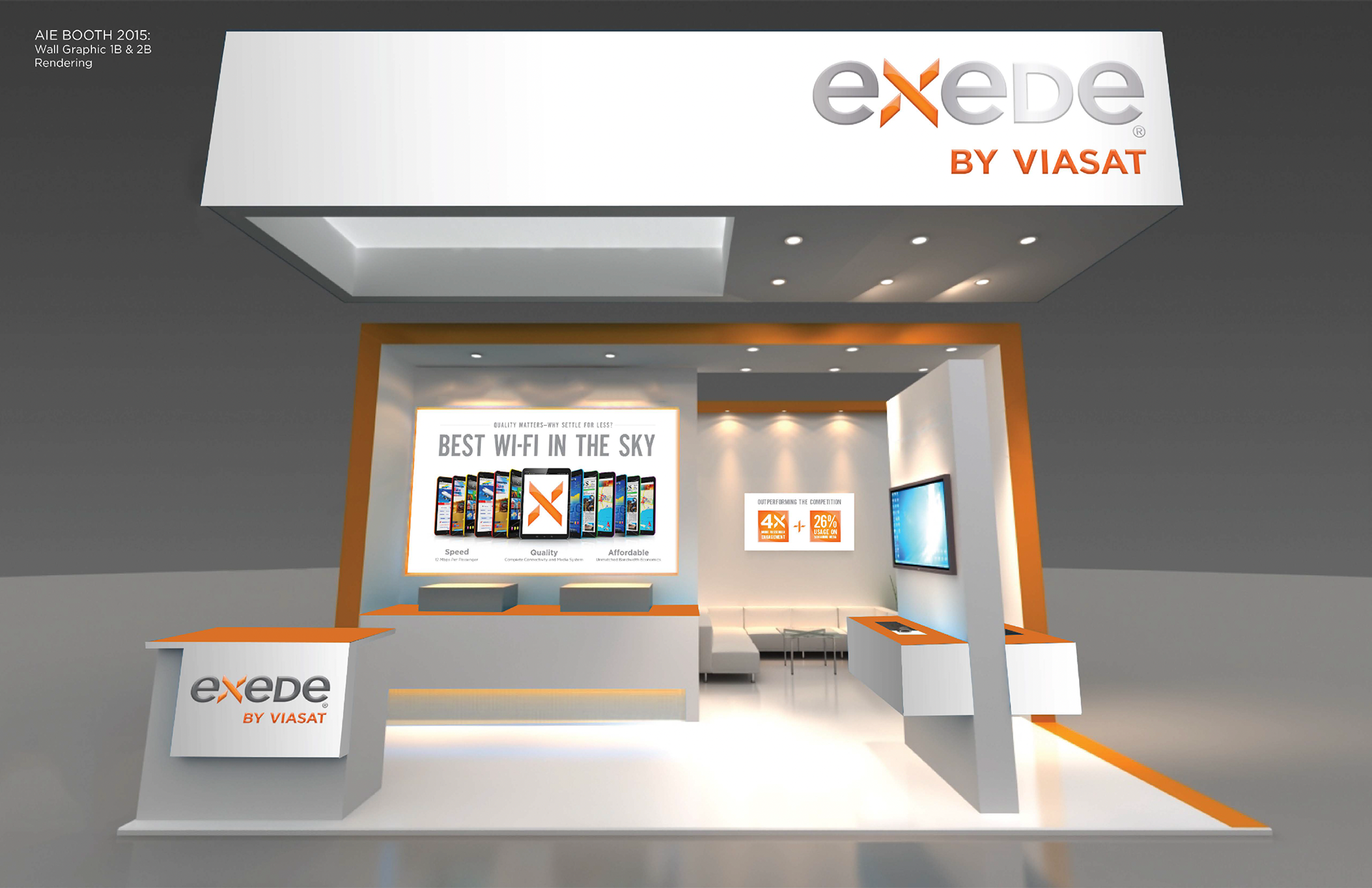
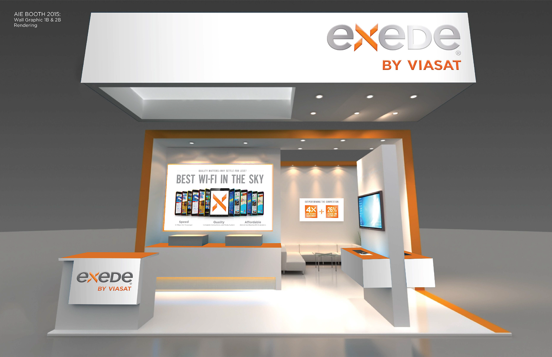
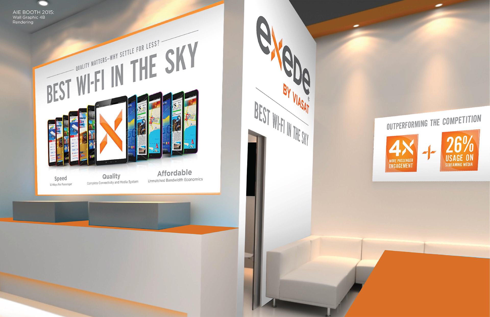
Direction two: proof by scale. Exede leading, white and orange, fascia carrying Exede by ViaSat large enough to read across a hall. A fan of a dozen devices, every one lit, the brand X mark alone on the center tablet. 4X and 26% as blunt blocks. The argument is the cabin: everyone connected, at once, the thing no competitor could match.
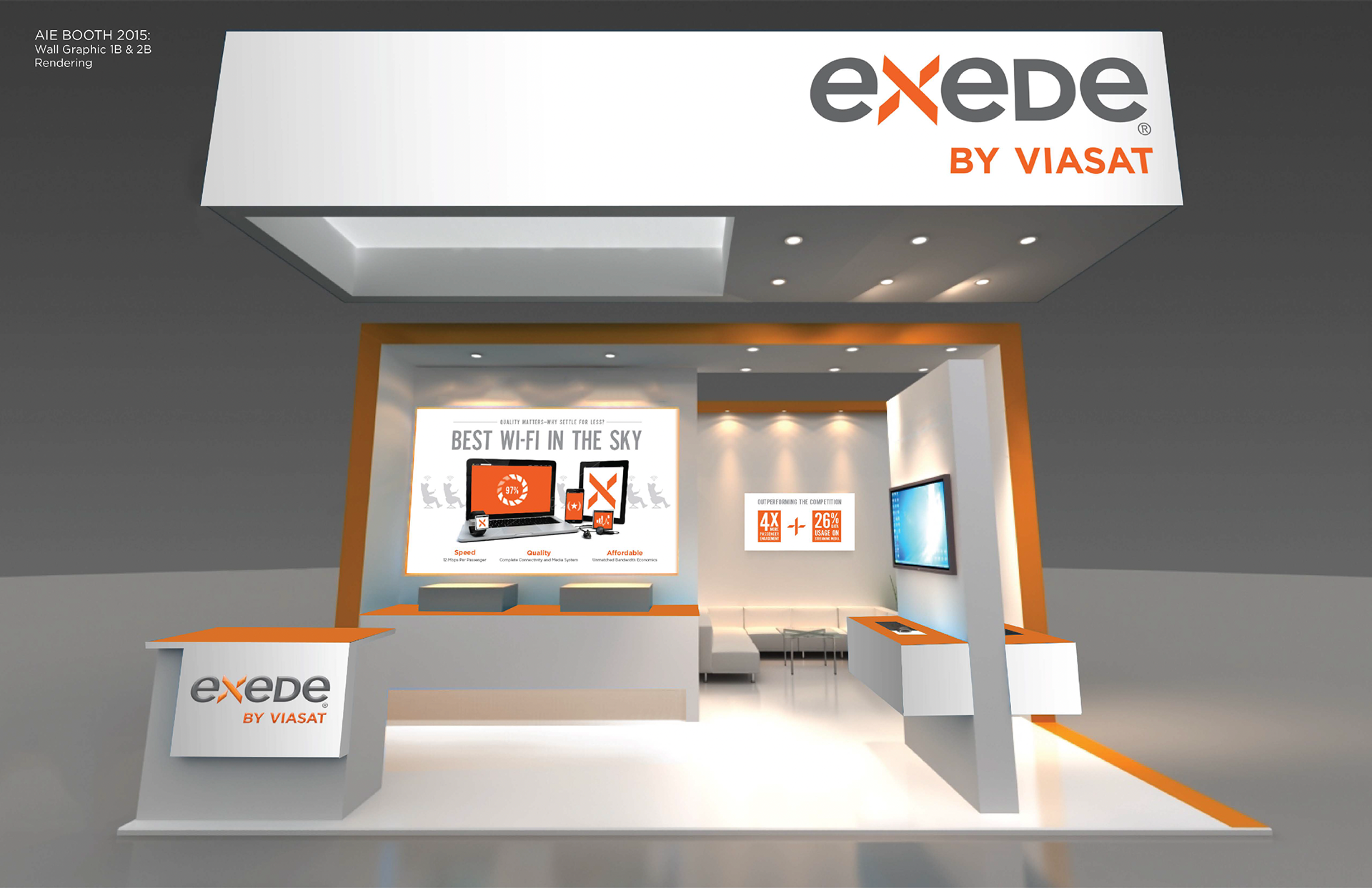
Direction three: a variation on two. Same structure, same white and orange, same fascia. The difference is the hero image and what it argues. Where two shows a dozen devices lit at once, three shows a single laptop with the loading ring resolving at 97%, the failure state every other service delivers, surrounded by phone, tablet, watch, and earbuds.
One direction asks the buyer to read. Two ask them not to have to.
The Change Leadership Made
Direction two was selected, with one revision.
The concept carried Exede by ViaSat across the fascia. Leadership replaced it with the existing blue logotype, and moved Exede down to the interior wall, the vertical banner, and the reception desk.
It was a real trade. Exede’s orange was the recognizable equity, the color a buyer would have connected to the service they’d read about. ViaSat’s blue was the corporate mark, correct and less magnetic from forty feet, especially against a white background. The exhibit gave up some recognition to gain architecture.
What it bought was clarity. Exede is what you experience, ViaSat is who makes it possible. Everywhere a buyer stood inside the booth, they saw the product. The one plane visible from across the hall carried the parent.
The Part Nobody Asked For
The concept comps used stock device screens, generic app grids, fine as texture, and nothing more.
They wouldn’t survive the audience, though. Every person walking that hall works in cabin interiors. They know what a real seatback system and a real passenger-device portal look like, and a fake one reads as fake from ten feet away. The wall promised a complete connectivity and media system while showing screens that belonged to nobody.
So I designed the system.
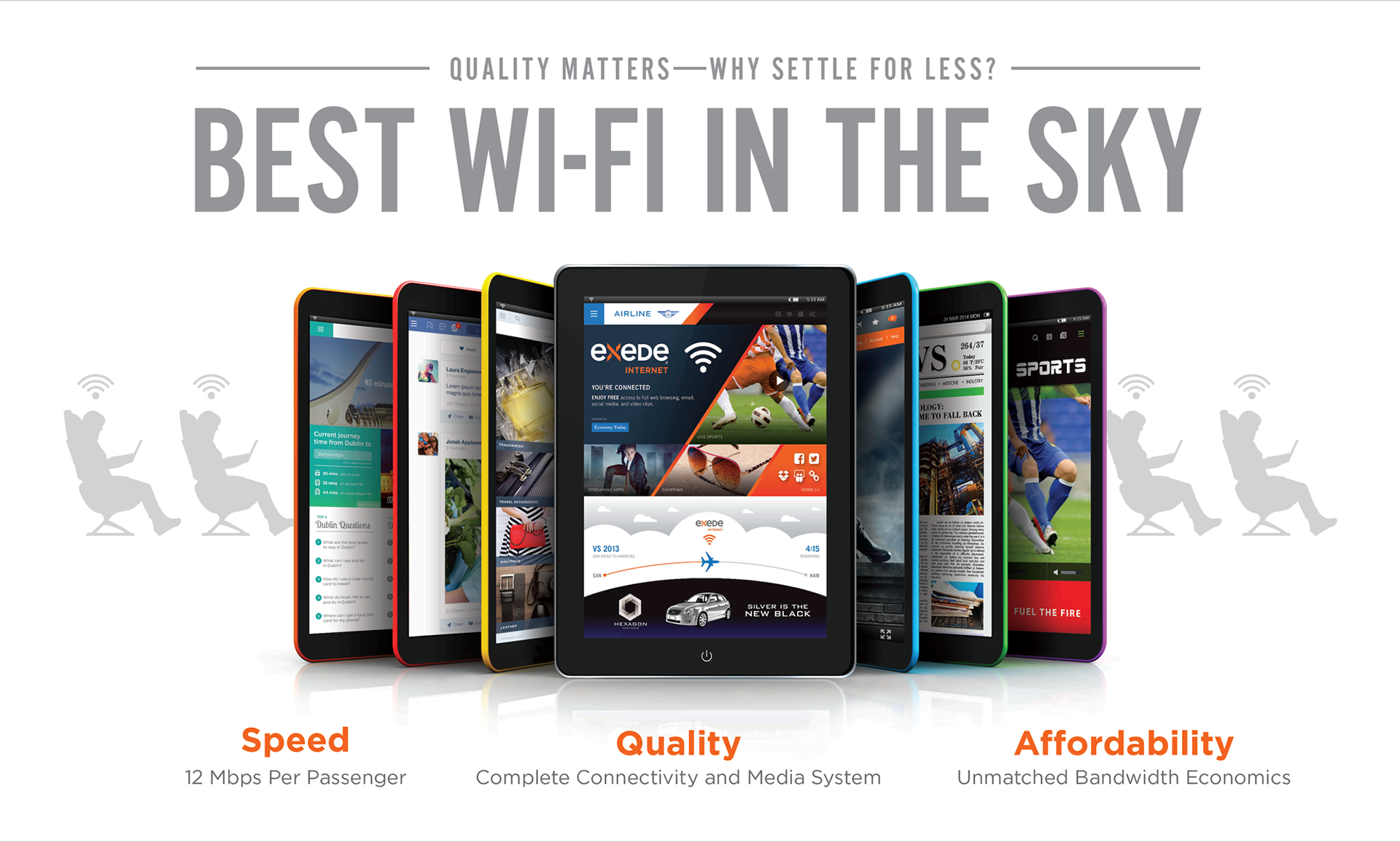
The Exede portal is the landing experience a passenger sees on connect: You’re Connected, free access to browsing, email, social, and video clips, with a sponsor slot sitting inside the free tier. Live sports, streaming apps, and shopping as content rails. A live flight tracker at the bottom reading VS 2013 San Diego to Hamburg, 4:15 remaining, which runs ViaSat’s home city to the show floor the buyer was standing on. Underneath it, a full-width automotive placement.
That last part is the business argument made visible. An airline doesn’t just buy bandwidth; it gets ad inventory and ancillary revenue against it. Unmatched bandwidth economics is a phrase on a wall—a sponsor unit inside a working portal is a P&L.
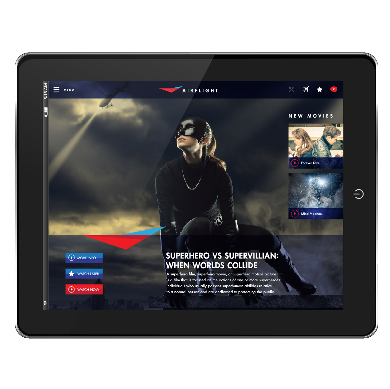
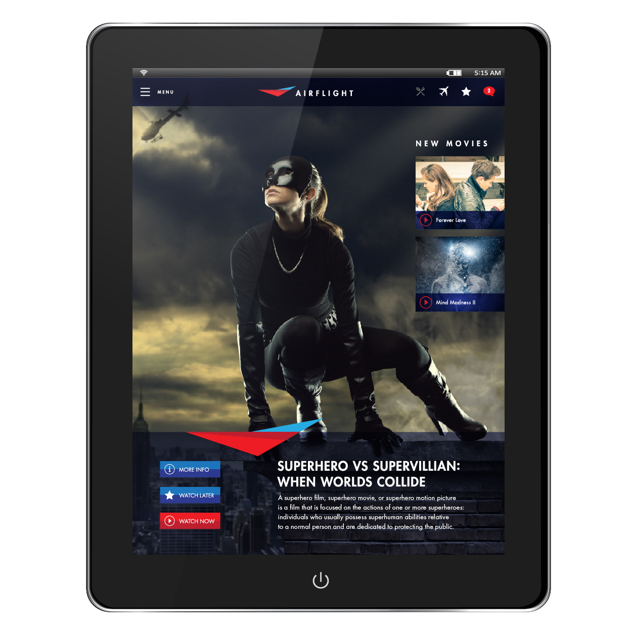
The Airflight entertainment UI is the other half: a co-branded seatback interface with a hero title, More Info / Watch Later / Watch Now, a New Movies rail, a signed-in user, and a video player with real transport controls. Built in portrait and landscape, because passengers stream on their own phones and tablets as often as they use the seatback.
Both went into the center tablet of the device fan. The exhibit stopped illustrating a media system and started showing one.
Holding the Line
The rest of production was subtraction.
The awards graphic went from four laurels to three, dropped a quote, and swapped in the Via Satellite Excellence Award for In-Flight Connectivity. Every remaining claim picked up a footnote: which service Routehappy rated and for which carriers, which APEX category, which Via Satellite award and vertical. Nobody at a trade show reads footnotes. They exist so that when an engineer asks, the wall answers.
The coverage map was rebuilt from an orange silhouette into an actual network, naming satellites ViaSat-2, ViaSat-1/WB-1/AF2, and the Eutelsat Ka-Sat partnership individually, with an Australia inset. It hung in the private meeting room, the only graphic in the stand designed to be studied sitting down, in a conversation that was already going well.
The Test It Actually Had to Pass
A trade exhibit is a three-day argument. The brochure is what the buyer takes back, and it has to answer the questions the exhibit only raised.
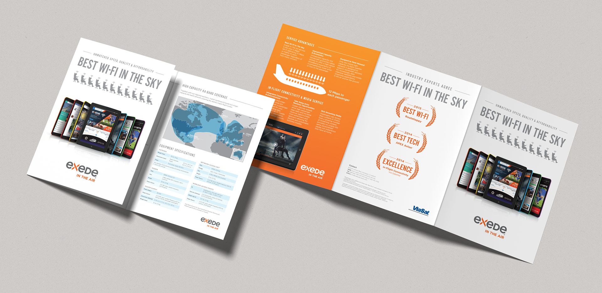
The system carried. The cover is the wall graphic, same headline, same laurels, same device spread with the Exede portal at center, but the passenger silhouettes moved from behind the type to a row of eleven across the top and the spread became a hero on white instead of a panel on a wall. The coverage map crossed over unchanged, labels and Australia inset intact. The three footnotes came with it, verbatim.
Then it went where a booth can’t. A cutaway diagram of how the service actually works: radome, antenna, modem, network access unit, cabin wireless access points, up to the Ka-band satellite, down through the gateway to the core node and the partner data center. Six specification tables covering ARINC 429 and 717 compliance, antenna swept diameter, power draw at 400 Hz, weights to the half-kilogram. The engineer who walked off the exhibit unconvinced gets everything they asked for.
And the Airflight UI ran full size across the interior spread, illustrating integrated connectivity and entertainment for the sales team’s leave-behind. The interface I built so a booth wouldn’t look fake became the product’s own sales material.
A system isn’t proven by surviving fabrication. It’s proven by surviving a completely different job.
The Results
The exhibit ran at AIX Hamburg in front of the global airline buying community. The white-and-orange system, the headline treatment, the award laurels, the coverage map, and the passenger-portal interface carried forward into ViaSat’s aviation sales and marketing materials.
What It Taught Me
In November 2017, the company announced it was retiring Exede, WildBlue, and Yonder, and unifying everything under a single name. ViaSat became Viasat. The stated reason was that too many sub-brands were diluting the parent, and the example leadership used was a passenger who experiences the service at 35,000 feet, then lands knowing whose it was.
I executed a large part of that rollout.
Two years earlier, on a header panel in Hamburg, the same call had already been made on the largest surface available. Not as strategy, but as a revision in a design review.
That’s what environmental work does. On a screen a brand can stay undecided indefinitely, or change in an instant. In a hall, at scale, in front of everyone who matters, an exhibit has to pick a name and commit to it.