Petco was already a household name. What they needed wasn’t a new identity—it was five of them, each one distinct, all of them coherent.
The Real Problem
The second largest pet retailer in the country, with strong brand recognition and a loyal customer base. What they were navigating wasn’t a question of who they were. It was a question of who all of them were. Five sub-brands. Five different audiences. Five different answers to the same underlying question: how much of this is Petco, and how much is something else entirely?
Petco wasn’t starting from scratch. That’s what made it interesting.
Every creative decision had to reckon with what already existed: the brand equity, recognition, and expectations that came with the name. The work wasn’t to invent something new. It was to find what was true about each entity and design from there.
The Work
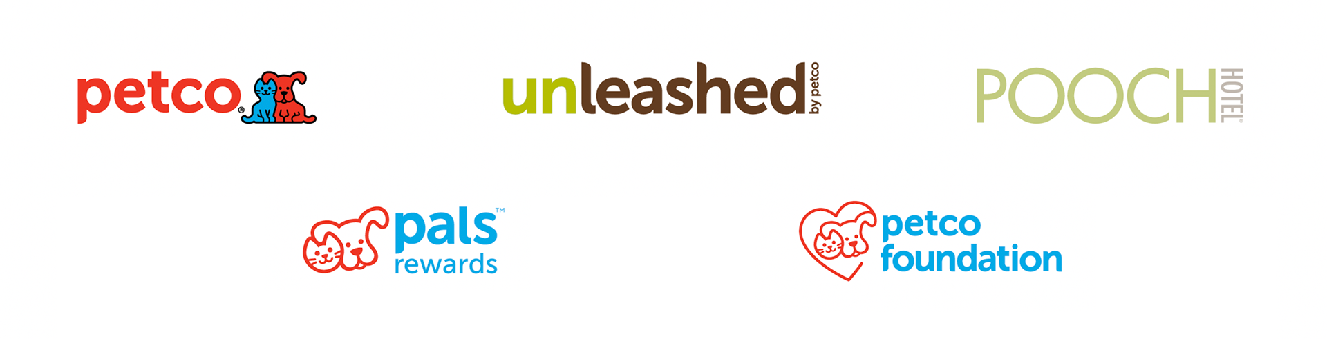
The Petco Foundation needed institutional credibility. A nonprofit face for a for-profit company. We adapted the iconic Red Ruff and Blue Mews, printed it in soft touch black: a finish that feels considered when you hold it, signaling care without sentiment.
Pals Reward needed warmth and accessibility so the primary red and blue Petco palette came forward. A system that said belonging, not transactions.
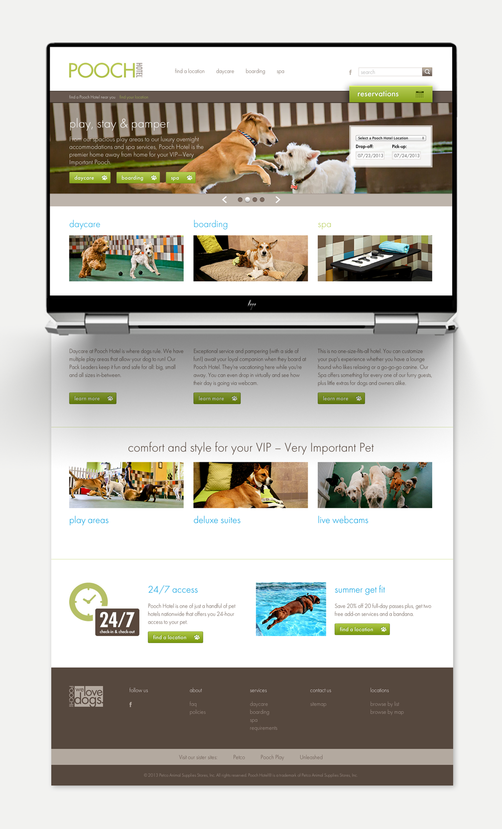
Pooch Hotel was a recently acquired premium kennel concept. It needed enough distance from the parent to justify a higher price point, without feeling like a different company. We pushed the visual register further here than anywhere else.
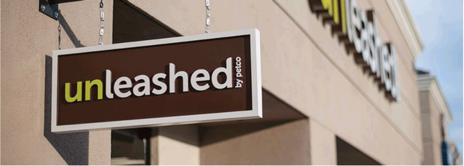
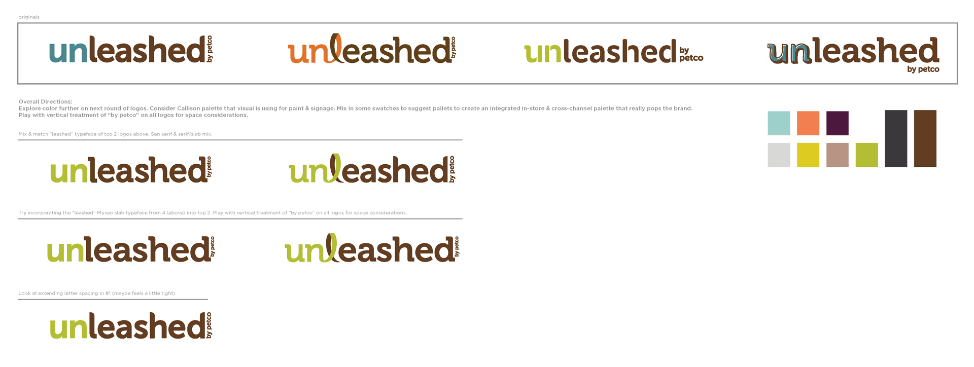
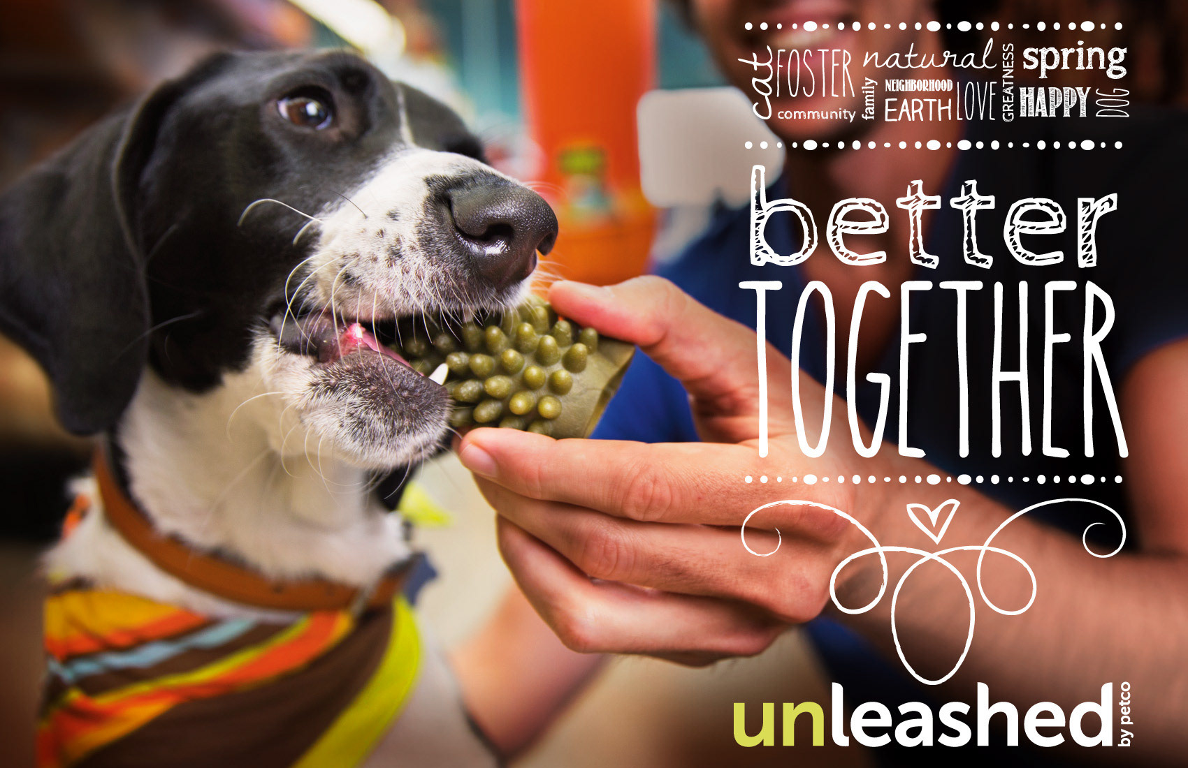
Unleashed by Petco was the hardest. The customer was urban, knowledgeable, willing to spend, and skeptical of anything that felt like a big box store dressed up. Making Petco fancy wouldn’t do it. The brief was to build something that earned its own credibility while being honest about where it came from.
The Creative Direction That Changed Everything
The answer for Unleashed by Petco lived in the prefix.
“UN” became a visual lever, a way to signal differentiation without severance. We explored how far Red Ruff and Blue Mews could be abstracted before they stopped being recognizable. We debated the name itself: Unleashed or Unleashed by Petco? That was never a preference question. It was a strategic decision about how much distance the market would accept, and how much the brand needed the parent’s equity.
Running underneath all of it: monthly brand style guides, deployed across departments, partners, and vendors. The operational system that kept five identities coherent across thousands of touch points. That infrastructure and consistency was as important as any single logo decision.
The Results
The Petco enterprise rebrand drove $387M in revenue growth. Unleashed by Petco contributed $209M following the brand repositioning. Five sub-brands with distinct identities, coherent within a single brand family, and sustained across monthly style guides deployed to every department, partner, and vendor in the system.
What It Taught Me
Rebranding is harder than branding.
Starting from zero is a creative problem. Rebranding is a diagnostic one. You have to understand what equity already exists, what’s worth keeping, what’s holding the organization back, and how to move it forward without losing the audience that already believes in you.
When I started Thallo Design, I positioned it specifically as a rebranding studio, not a branding studio. Every client who came to me thinking they needed something new actually needed to understand something true first.
The best creative work doesn’t start with what something should become. It starts with what something already is.